Hikari Miso
Branding
This project, in collaboration with the Fresh Ideas Group,explored a whole new direction for the Hikari Miso brand in the U.S. market.
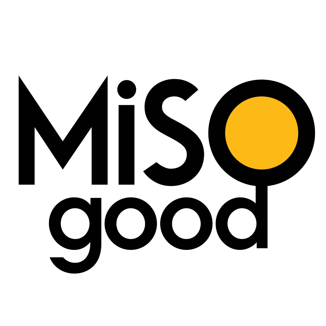
The messaging brings in the word ‘good’, which reinforces the healthy goodness and great taste of Miso. The font is strong and playful. The yellow sphere represents the rising sun of Japan, but uses a brand compliant color. It also give us a birds eye view into a bowl of goodness!
Your brand should have ‘market-love’. It should tell your story and leave a lasting impression in the minds and hearts of every consumer.


